Waternet
The client
Waternet is a Dutch public company engaged in drinking water supply, sewerage and water management. They supply drinking water in the region of Amsterdam. Within Waternet, Team Online is responsible for the websites waternet.nl, agv.nl and wereldwaternet.nl. Important themes are ease of use and accessibility. As the UX Designer, I resolved pain points for the customer environment and increased the value and relevance of the digital products.
Tasks and responsibilities
- Retrieve information from stakeholders about business goals and user needs
- Explore new product requirements and criteria for the design
- Supporting designs for the frontend team to achieve WCAG 2.1
- Point of contact for design-related questions around the online environments
- Lead creative sessions
- Design of click paths, wireframes and components
- Working in a multidisciplinary Agile/Scrum team
Calculate water authority tax
Deliverables: flowchart, wireframes, visual designsTeam online was asked to help give customers insight into the upcoming 2024 water board tax. Since the water authority tax would increase a significant amount in the upcoming year, users needed to be timely informed of the impact this would have on their bill.
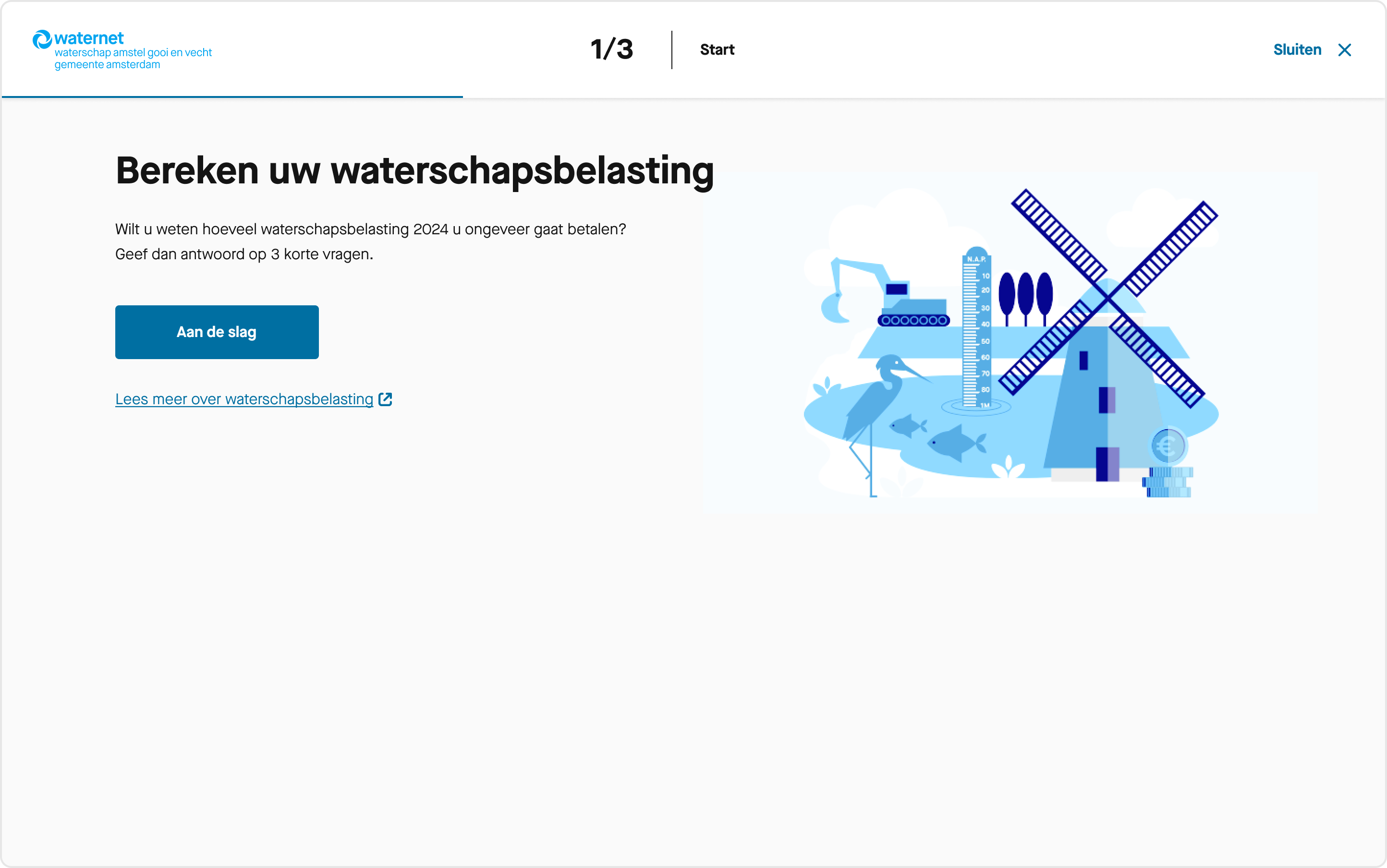
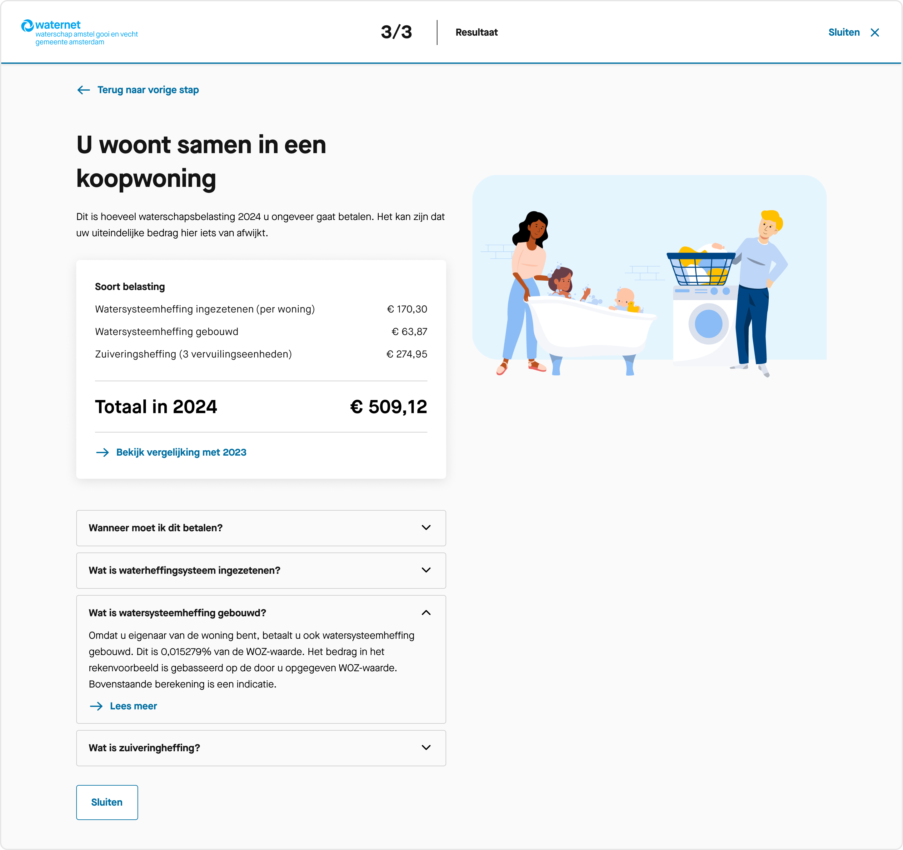
For this purpose we built a calculation tool. By answering two or three simple questions, we return a tailored and realistic picture of their individual costs.
Process
I first analysed the business request and underlying issues. We were working in the context of the summer of 2023, when Waternet was suffering from reputational and credibility issues due to problems with their billing on the previous year. This needed to be taken into account when informing users about the increasing water tax.
The tax itself was based on 1) if you rent or own a house, 2) the value of the property and 3) if you live alone or together. After a brainstorm with the team we concluded that asking these questions in a short user flow, could return a fair estimate for the new water tax.
I drafted an elegant and simple user flow with supporting UX copy.
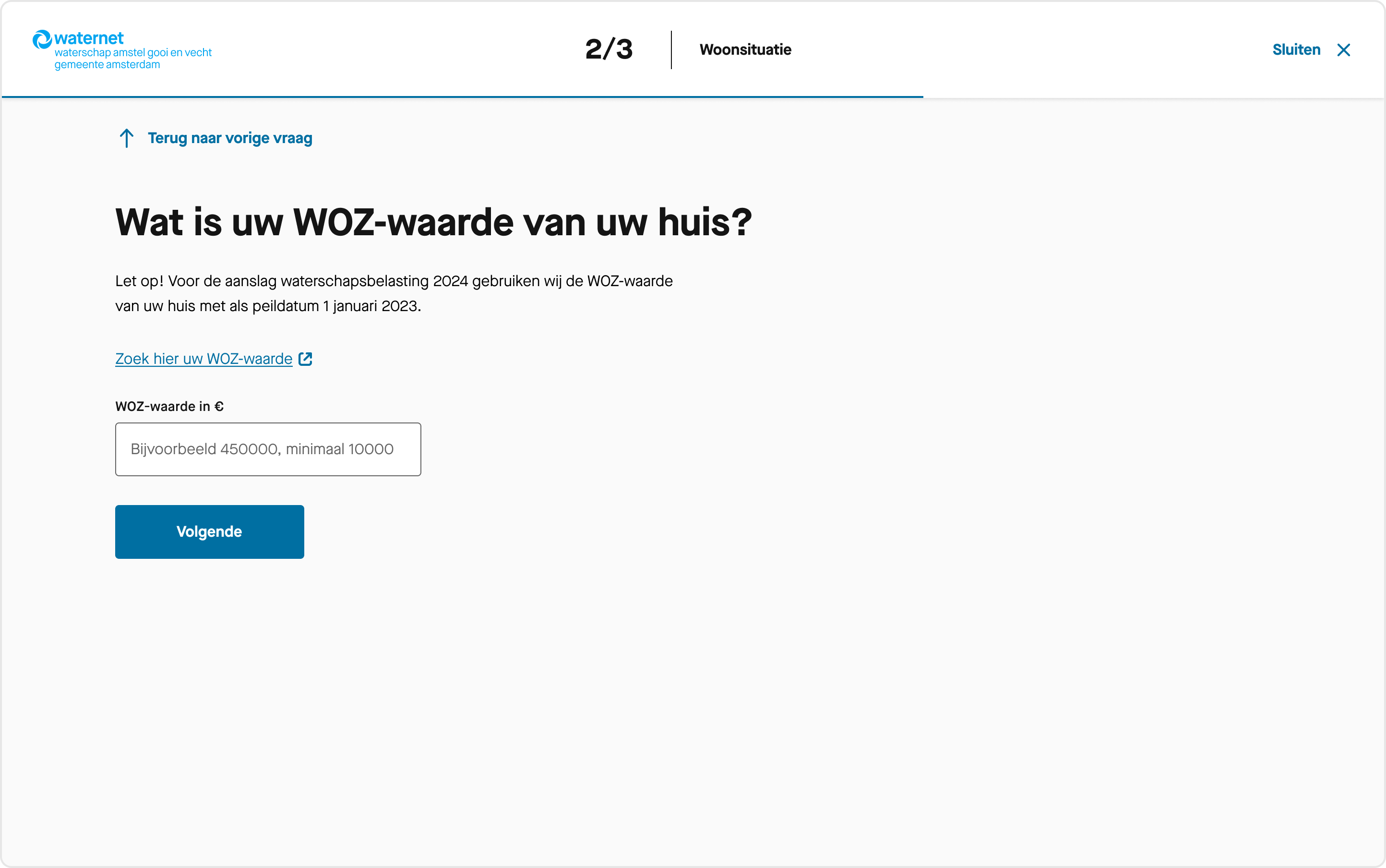
I advised the communication team to give context and provide some insights on why exactly the water tax was increasing. These arguments could make the financial impact more understandable.
For implementation we reused existing frontend components. Therefore the team was able to build the calculation tool within only 2 weeks, instead of the 4-5 weeks initially estimated. A great demonstration of the power of consistent design and reusable frontend building blocks.
Product benchmark analysis
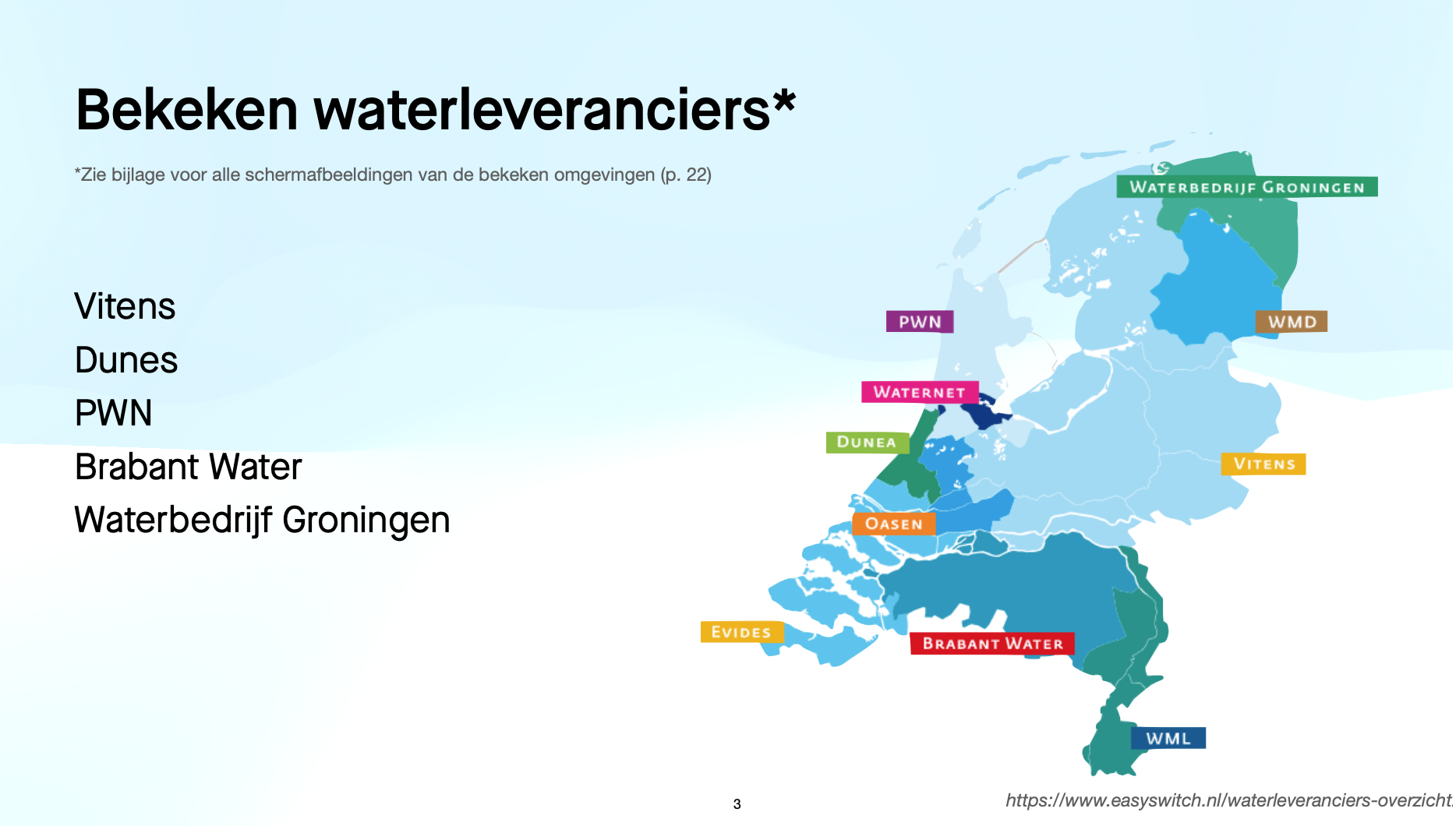
Deliverables: analysis, research (explorative stage)I found that there was no active knowledge sharing across water companies operating in different Dutch provinces. In light of this, I conducted a benchmark analysis, analising and learning what other companies offer in their online environment. This could inspire and help validate the need for new features.
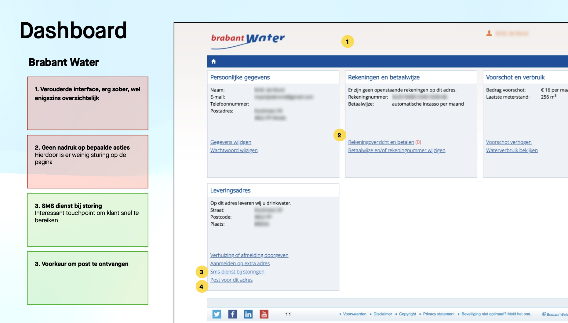
I started collecting screenshots of the logged-in environments from all water companies. For this I reached out to users across the country. Four pages and user flows were analysed:
- Dashboard
- Billing
- Personal details
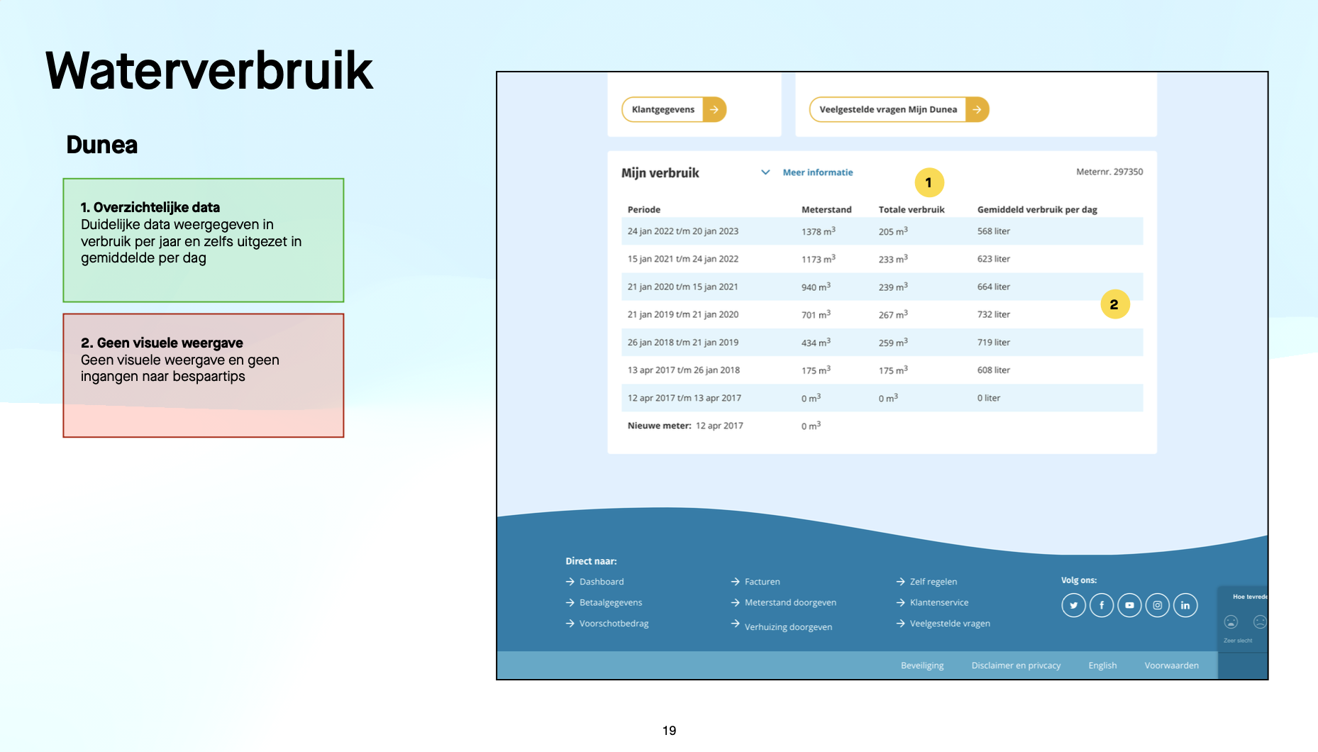
- Water usage
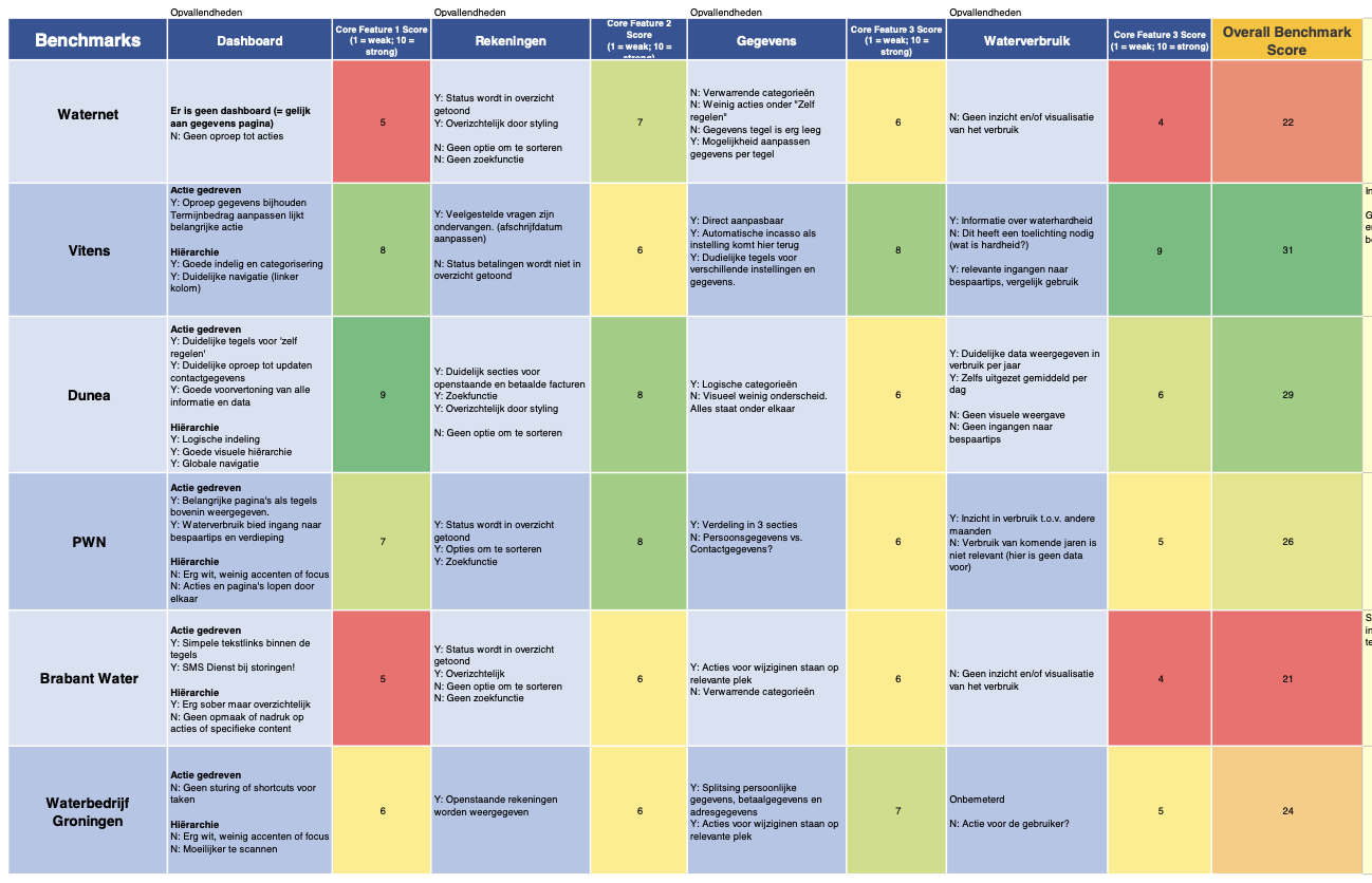
I rated the designs on the 3 categories: general functionality, prompting action and lay-out and visualisation. Every page was analysed and rated a number from 1-10. Adding up the ratings, it showed which environments were leading for the industry.
I collected the results and translated the take-aways into a pdf that was shared with relevant stakeholders. The report showed the industry standards and what consumer centric improvements are found (such as informing about water hardness and personal tips to save in water usage). The deliverables sparked relevant conversations and offered guidance for further design decisions to enrich the user experience.
